Some Color in the Alpine Village

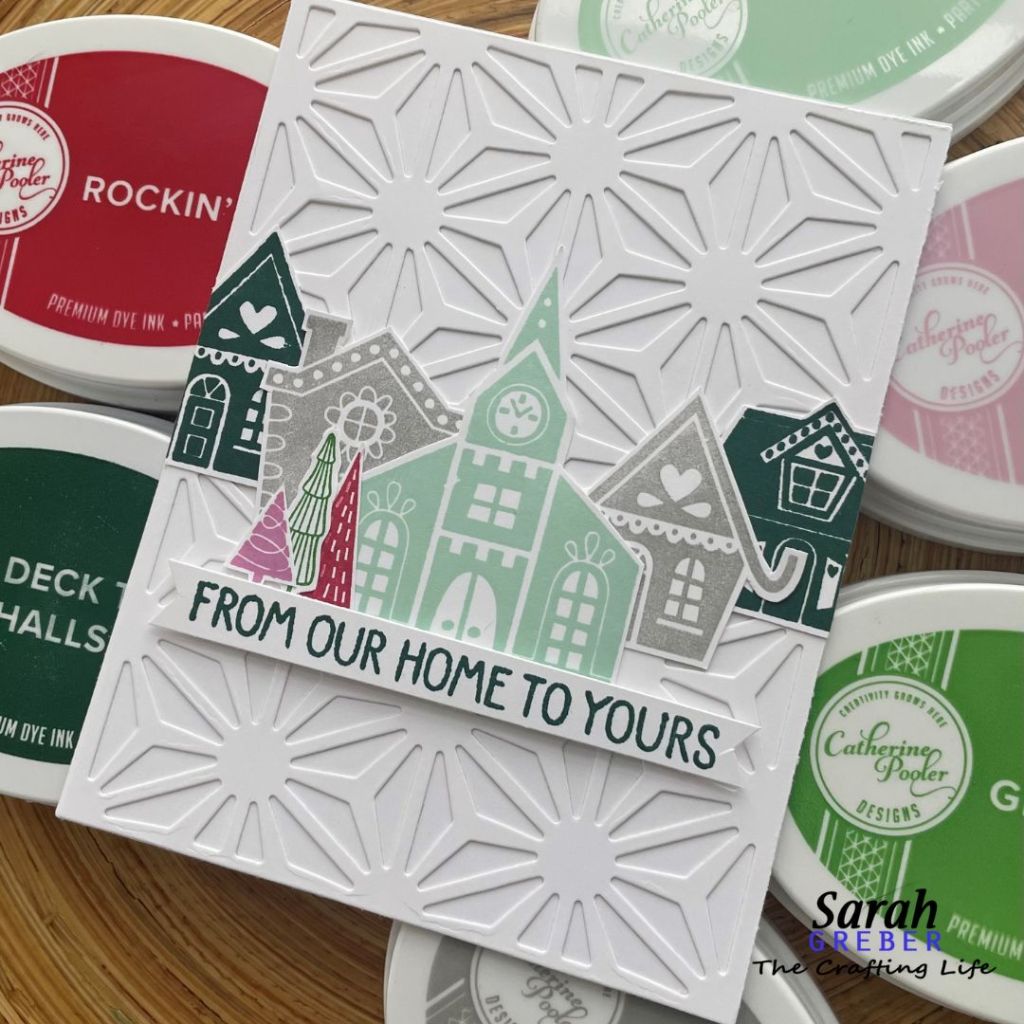
How about some color for the Alpine Village?? Lots of color!

I ink blended the background of some pieces and when I overlaid the swiped cover plate pieces, I kind of liked the combination! So, these are some more colorful versions of my snow filled Alpine Village.

I was swiping – or swinking – for the Jack Frost cover plate part. It’s fast, easy… and brings some bold colors to the card right away!

This color combo is from a StampNation friendly color challenge between some of the members. I jumped in to see how fun it was. And it was fun. 🙂

How about a few of the pinks and reds? I think Pink Champagne is maybe my all-time favorite color. I just love it. More swinking here, but I didn’t overlay it with the pink blended background because it started to look a little too Valentine-y and I wasn’t going for that quite yet. But hey, when it’s time for all the love, that would be a fun look to play with!

What do you think about how these are turning out? So much fun, right?

#TheCraftingLife
#TheGreberCraftingLife
#CatherinePoolerDesigns
#CatherinePoolerInks

From Our Snowed In Home, to Yours

Oh, you know. We had a bit of snow this weekend. Well, maybe a LOT of snow. The storm was one of those where I couldn’t get anything done because we were worrying. But then, I pulled out the Alpine Village stamp set and got to work on distracting myself.

Our neighborhood really is like an Alpine Village this week. Perfect with the Jack Frost cover plate… for the snow and ice surrounding us. The windows showed actual snowflakes and frost. It was neat to see it up close.

I made a few different cards with the village. These two cards are the two with the white cardstock on the cover plate. I did add blended backgrounds to some, and in a future post, I’ll share versions where the cover plate is swiped with lots of color! All supplies that I used are from Catherine Pooler Designs. Her cardstock is the best! This cover plate is my favorite. And the ink colors… well, you know they are my go-to.

I did use the same sentiment on all of them. I figure I can use these at any time this winter!

From our snowed in home to yours! Happy Holidays!

#TheCraftingLife
#TheGreberCraftingLife
#CatherinePoolerDesigns
#CatherinePoolerInks

Lots of Color and Bits of Color – Who Does it Best?

So… what do you think about a very colorful background? Fun right? This is a technique from our StampNation community, that we practiced together. For mine, I used this awesome color palette of Catherine Pooler Inks from a fellow crafter. I love the bright and fun tones. I swiped each ink color down the page and didn’t make it uniform. I just let the colors play where they wanted to.

I clear embossed the stamped background before I added the inks. Then I did the Batik technique. I love the end result. I had a few hot beverage stamps I was playing with, so they made it to the front of this card with a simple sentiment. I feel like the ‘Anything is possible’ plays into the whimsical feel of the card. What do you think?

I think I might have mentioned that I was able to use this technique piece to make a few cards. Here’s another one, simple and easy as can be. I did run the background through a small polka dot embossing folder.

I don’t know about you, but I do try to enjoy the little things. Some days it’s easier than others!

Check out this last card I was able to make, using some of the Batik piece behind the trees.

I feel like it gives the air a nice swirl of fun. And, the hearts that go with this stamp set are a fun add-on accent to each of my cards.

The cup of coffee stamp is so fun to play with. I will make more. A misti does help to get a crisp image with this larger size stamp. I moved my piece when I stamped the green one, so that was a one-time chance on that one. haha. I still like it anyhow.

Hope you’re enjoying these beverage cards so far!

#TheCraftingLife
#TheGreberCraftingLife
#CatherinePoolerDesigns
#CatherinePoolerInks

Tis the Season for… Warm Beverages

All kinds of warm beverages, really. But how about a month filled with this really neat warm beverage image? It could be coffee… latte… or maybe, in my case, hot chocolate. What kind of hot beverage do you enjoy the most?

I love hot chocolate. So for me, I will pretend that this is a nice hot chocolate with a creamy foam on top. Perfectly made into hearts. This set is really fun (Catherine Pooler Designs) – but the colors – those are the part I had the most fun with this time!

I took these colors as a challenge from one of my crafty friends in the StampNation. I saw a card she made with these colors and knew I had to play around with it. I also wanted to try the Batik technique we were learning in our stamping community. The ‘THANKS’ from this card is cut from a scrap piece of my Batik technique panel.

And, I think my even more favorite part of this card is the Jack Frost Cover Plate. It’s amazing. Maybe it’s my new di-cut machine or maybe it’s just the perfection of the di-cut, but I love it so much!

This card shows the darker Batik technique piece a little more. I think it turned out pretty cool! And, I was able to get multiple cards out of these pieces. This paired perfectly with the sentiment set that wraps around the edges of circular items. I think I’ll make some more!

Although I made 5 cards out of all of my pieces, these are just the first two. And I think this birthday one is my favorite of the whole bunch! We’ll see if you agree!

#TheCraftingLife
#TheGreberCraftingLife
#CatherinePoolerDesigns
#CatherinePoolerInks